Clarity speaks louder than noise
Today I spent some time exploring websites, not with the goal of finding features or comparing them, but just noticing how they made me feel. I realized how much the first thing you see, the hero section, can shape the entire experience.
Some sites greet you quietly. They show the product, a small demo, or a simple visual of what it does. You immediately understand the value and feel a kind of trust. It is as if the product itself is speaking to you, saying this is why I exist and this is how I can help. That first impression is subtle but powerful.
When the hero section is clear, it feels like a friend guiding you. You do not have to guess what to do next. You see the value, and you know where to go.
I noticed this particularly on sites like Apple and Linear. They do not try to overwhelm or impress. They present what matters and let it breathe. The moment you land on their pages, your attention is naturally drawn to the right place. You do not need to hunt for information or decide between ten options. The experience is calm, confident, and direct.
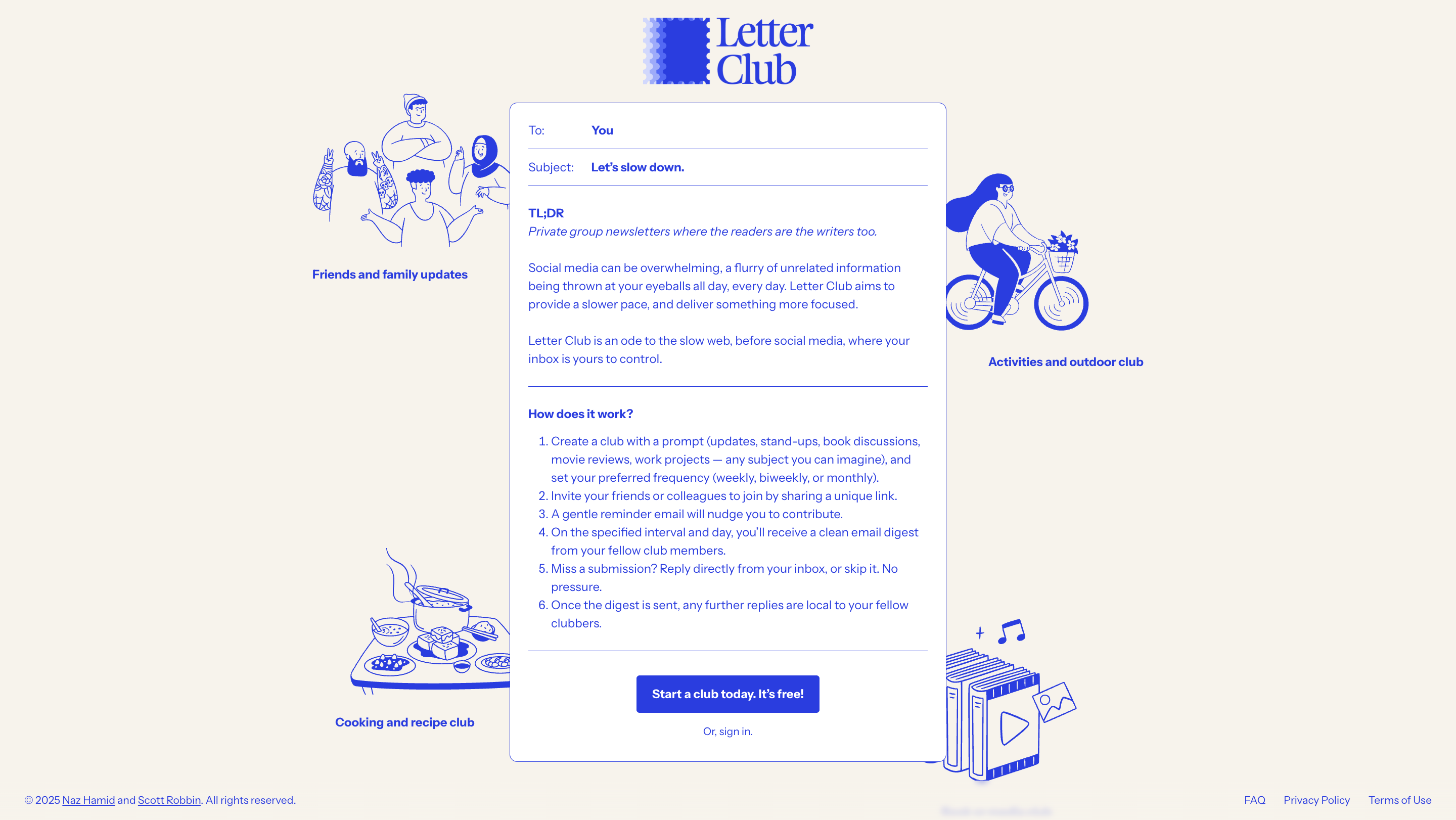
Letter Club surprised me in a different way. Their hero section was minimal, yet it had a playful energy. The CTA caught my eye immediately, simple and creative, and it sparked curiosity. I found myself signing up just to see what would happen next. The colors, the typography, the layout, everything felt intentional. It felt alive without being loud.
Then there are sites that feel heavy. Lingscars.com was one of them. There was so much happening at once that I did not know where to look first. My eyes wandered, my mind wandered, and it took effort to figure out what to do. I realized then how important clarity is. It is not about removing personality or creativity. It is about guiding attention and showing value without confusion.
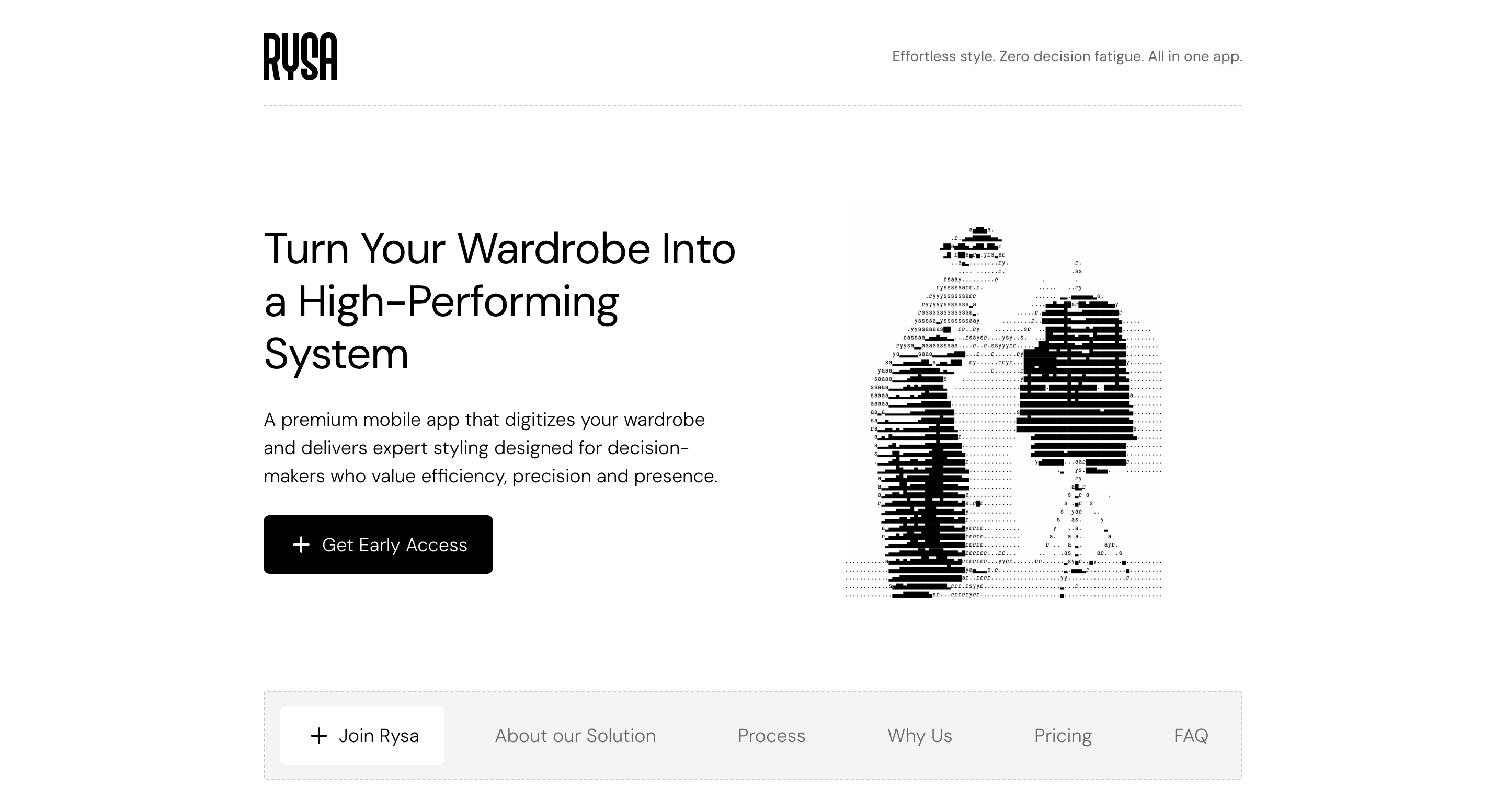
Rysa caught my attention too. They are digitizing wardrobes, and they show it beautifully. A small demo of a wardrobe in action, even rendered with playful visuals, made me understand instantly what the product offered. It was engaging and unique, not generic. It reminded me that visuals and videos work best when they tell a story about the product rather than just decorate the page.
What I took away from this day of discovery is that simplicity is not about doing less. It is about being intentional. It is about designing a path for the user without forcing them to guess. It is about showing value in a way that feels effortless and trustworthy.
I am learning to appreciate these quiet lessons in design. They do not shout. They do not demand. They invite, they guide, and they reflect care. Clarity is a form of respect, and when it is done well, it feels like someone truly thought about you even before you arrived on the page.